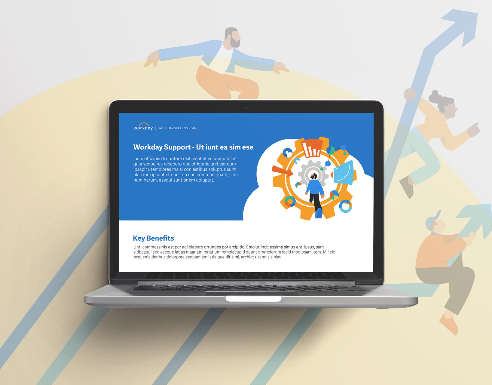
The Brief:
Workday Success Plans (WSP) is a sub-product within the broader Workday ecosystem. Over time, the offering has expanded its services, business model, and organizational structure. However, this rapid growth created challenges in onboarding new team members and aligning resources, goals, and enablement materials.
To address these issues, a unified site was proposed to centralize product knowledge, enablement resources, process documentation, news, onboarding materials, and broader team initiatives.
My Role:
Art Direction, User Research, Wire-framing, and Web Design.
Impact and Outcomes:
✅ 32% Improved onboarding efficiency – new team members can access structured resources and processes immediately, reducing ramp-up time by one whole month.
✅ Centralized knowledge base – all product information, processes, and enablement materials now live in one accessible location.
✅ Positive feedback from stakeholders – teams report easier alignment, faster access to resources, and reduced reliance on email or scattered documentation.
✅ Centralized knowledge base – all product information, processes, and enablement materials now live in one accessible location.
✅ Positive feedback from stakeholders – teams report easier alignment, faster access to resources, and reduced reliance on email or scattered documentation.
Challenge & Solution
Challenge: As Workday Success Plans rapidly expanded, knowledge, processes, and enablement resources became fragmented across multiple channels. This created friction in onboarding new team members and made it difficult to align teams with consistent goals, content, and processes.
The challenge was to design a unified platform that could centralize a wide array of content types while remaining scalable and easy to navigate.
Solution: In my role, I led art direction, user research, wire-framing, content design, and web design to develop a centralized site. By identifying user pain points and mapping content needs, I created a streamlined information architecture and clean visual framework.
The final design consolidated product knowledge, process documentation, onboarding materials, and team initiatives into one accessible, cohesive hub—improving both onboarding efficiency and organizational alignment.
“The challenge was to design a unified platform that could centralize a wide array of content types while remaining scalable and easy to navigate.”
Research & Insights
To understand how teams were currently accessing Workday Success Plans resources, I conducted stakeholder interviews, user surveys, and content audits. The research revealed three recurring pain points:
🛑 Fragmented Access – Resources were scattered across email threads, shared drives, and outdated wikis, making it difficult for users to locate product information.
🛑 Onboarding Bottlenecks – New team members reported that it often took weeks to find the right training or process documentation, slowing their ramp-up time.
🛑 Inconsistent Content – Multiple versions of similar resources existed in different places, leading to confusion and inefficiencies.
From this research, it became clear that users needed a single, authoritative source of truth that could scale as the business grew. These findings directly informed the site’s information architecture, content strategy, and design priorities, ensuring that usability and clarity stayed at the core of the solution.
Design Approach
Site Map
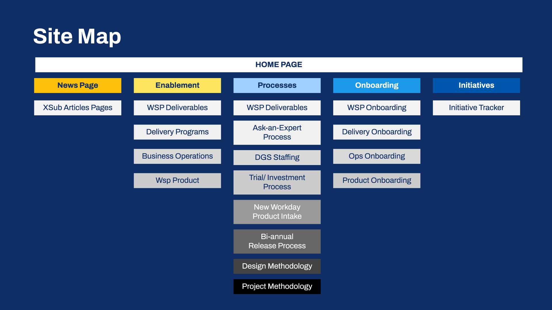
To bring clarity and scalability, I created a structured site map anchored by a Home Page with five main sections: News, Enablement, Processes, Onboarding, and Initiatives.
Each section contained subcategories tailored to user needs. For example, Enablement covered feature adoption, deliverables, and webinars, while Processes documented staffing, release planning, and methodologies. I also built in flexible “sub-article” pages that could fit under multiple categories, ensuring the system could grow with the organization. This structure balanced immediate usability with long-term scalability.
Wire-framing
Wireframes were designed to prioritize long-form readability while integrating contextual links and resource modules, ensuring users can stay focused on content while easily accessing supporting Workday Success Plan materials.
Wireframes were designed to prioritize long-form readability while integrating contextual links and resource modules, ensuring users can stay focused on content while easily accessing supporting Workday Success Plan materials.
There were five main goals of the wireframes:
1. Focus on long-form readability
2. Content hierarchy
3. Support of contextual links and resource modules
4. Seamless organization of supporting materials
5. Balanced depth and accessibility
“Designed for long-form readability with seamless access to supporting Workday Success Plan resources.”
Discovery: Balancing Density and Usability
In discovery, I quickly realized one of the biggest pain points: sections like Processes and Enablement were overflowing with long, detailed documentation. Users felt buried in information and struggled to find what they needed. The conflict was clear—too much detail made the site unusable.
The resolution came with collapsible groups, which gave users a way to scan at a glance and expand only when they wanted the detail. This small shift turned overwhelming pages into a clear, navigable experience.
The resolution came with collapsible groups, which gave users a way to scan at a glance and expand only when they wanted the detail. This small shift turned overwhelming pages into a clear, navigable experience.
They were able to achieve these goals:
1. Manage content density
2. Reduce visual clutter
3. Support different user needs
4. Scalable structure
Visual Design
Home Page
✅ Establish authority and credibility by using strong, recognizable brand imagery prominently on the home page.
✅ Color blocking was introduced as a visual system to clearly separate different content sections and guide the eye.
✅ Hierarchy and clarity were reinforced through distinct visual zones, helping users quickly identify where to find key Workday information.
✅ Visual impact paired with usability to create a homepage that felt both professional and approachable.
✅ Consistency with brand identity ensured the page felt both authoritative and aligned with Workday’s overall brand language and identity.
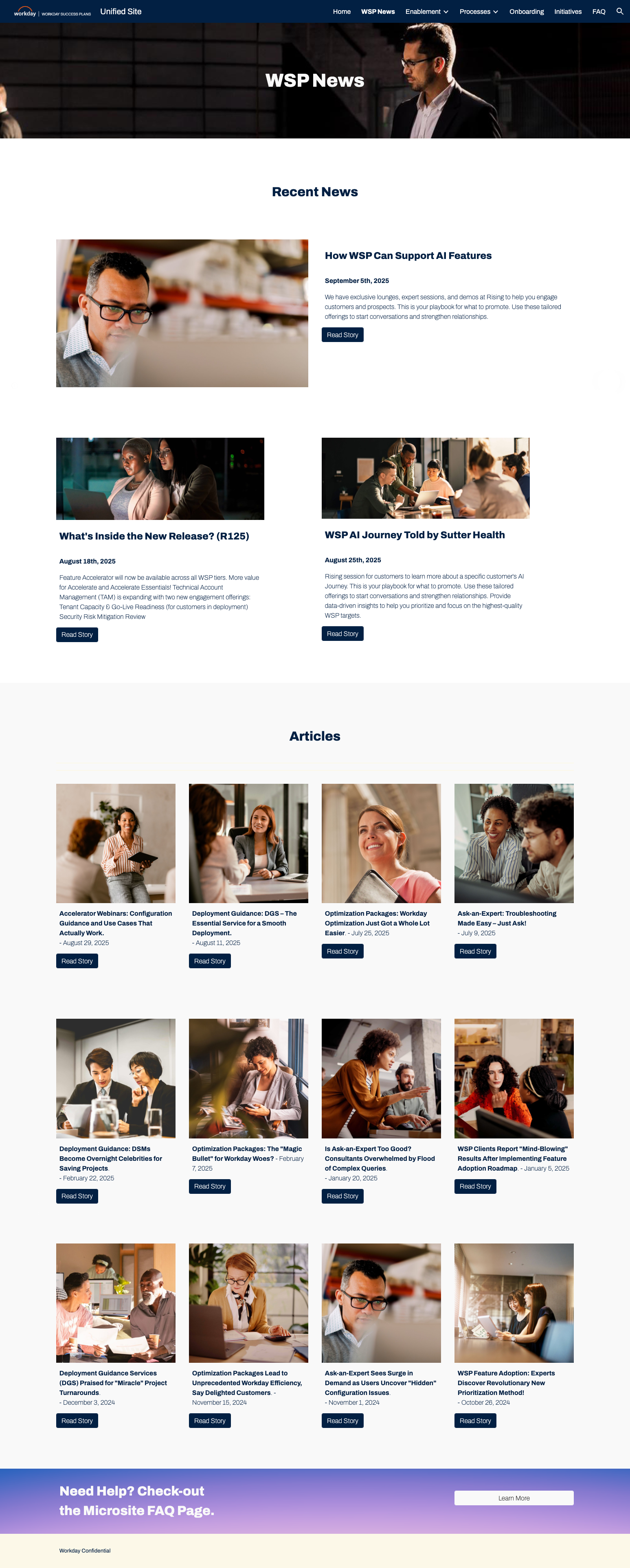
Article Library Pages
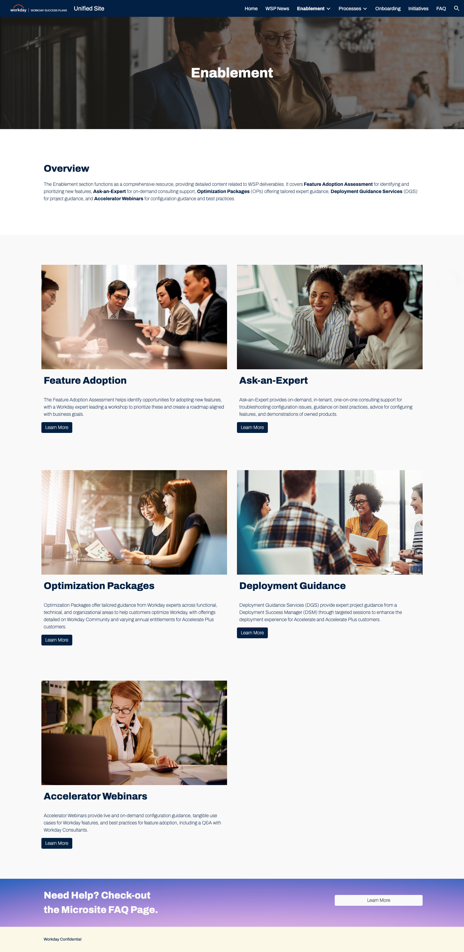
✅ Centralized content hub allowing users to quickly browse and locate articles across multiple topics.
✅ Centralized content hub allowing users to quickly browse and locate articles across multiple topics.
✅ Visual organization through clear typography, spacing, and sectioning to reduce overwhelm in a large content set.
✅ Consistent navigation and hierarchy ensured users could move seamlessly between library results, topic pages, and individual articles.
Topic Article Pages
✅ Organized related content into clear groupings, helping users understand the breadth of resources available under a given theme.
✅ Consistent navigation patterns ensured users could move between topics without losing their sense of place.
✅ Collapsible groups allowed users to scan broadly, then dive deeper when needed.
✅ Balanced structure and flexibility supported both new users seeking orientation and experienced users looking for specific content.
News Article Pages
✅ Optimized for readability, with clean typography and generous spacing for long-form documentation.
✅ Contextual resource links integrated within the content flow to connect users to related tools and processes.
✅ Clear metadata and labeling (author, date, section) to reinforce authority and trust.
✅ Consistent layout framework provided familiarity across articles, reducing learning curves.
✅ Designed for scalability, supporting everything from short updates to in-depth process documentation.
FAQ Page
✅ Quick access to common questions with clear grouping by topic to reduce user frustration.
✅ Expandable/collapsible answers to allow users to scan questions quickly and reveal details only when needed.
✅ Cross-linking to related resources so users can dive deeper if they need more context.
✅ Scalable structure to accommodate new questions as the product and processes evolve.
Mobile View
The mobile view follows the same core design goals, with only a few adaptations made to improve the experience.
The mobile view follows the same core design goals, with only a few adaptations made to improve the experience.
The changes that were modified for mobile use were:
✅ Increased font sizes: Ensure body text is large enough (at least 16px) without zooming.
✅ Single-column layout: Avoid sidebars that clutter small screens.
✅ Mobile-friendly menus: Collapse navigation into a hamburger menu or sticky header.
Reflections
This project reinforced the importance of balancing long-form content with straightforward navigation and interactive elements like collapsible groups. Planning a scalable structure early allowed the site to grow without major redesigns. In future projects, I’d like to explore more interesting page interactions to improve usability and engagement further.
